// Case Study
Cobb Anger Management: a ten-year practice gets a front door built for deadlines
A nationally certified anger management practice with a decade of Google reviews and a website that made people work to find the price and the button. I rebuilt it around the four questions a court-ordered client actually asks, wired every page into a CMS, and moved the domain off Wix.
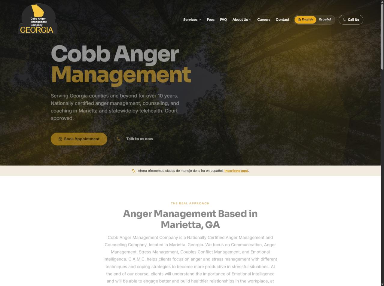
The buyer nobody designs for
Most websites are designed for browsers. Court-ordered clients are not browsers. Someone with a court date and a probation officer does not want to read about emotional intelligence. They arrive with four questions and a deadline. Is this court approved? How much does it cost? When is the next class? How do I book it?
Cobb Anger Management Company has been answering those questions in Marietta for over a decade, with a 4.9 Google rating across 259 reviews to show for it. The website was the weak link. It lived on Wix, the booking calendar was a link out to Acuity, and the service pages read like course syllabi. The proof was real. The front door made people work to find it.
Design around verification, not persuasion
I built the new site around one idea: a court-ordered visitor should be able to verify everything in under a minute and book in under three.
That decision shaped the whole homepage. Instead of listing every service with equal weight, the hero asks one question, "What brings you here today?", and offers three paths: court ordered, personal and family, and workplace. Three featured services follow, then three steps (book or call, complete your sessions, get your certificate). The court documents you receive at the end of the Saturday class are listed by name, because that is exactly what the client's lawyer will ask about.
Every service page follows the same slimmed template: an "At a glance" block with the facts, a short overview, the content that matters, and a sticky call-or-book bar. I cut whole essays that were pulling attention away from the price and the button.
The most valuable work was subtraction
Three things got removed, and each removal made the site better.
The custom booking engine. I had built a full native booking system for this site, with a database, an admin dashboard, Stripe deposits, and reminder emails. Then we looked at how the practice actually runs. They already live in Acuity Scheduling. Their classes, their deposits, and their reminders were all there and working. So the custom engine was shelved and Acuity was embedded directly on the booking page, with a per-service deep link on every service page. The client kept a booking flow they already knew how to manage, with fewer moving parts to break.
The forms. Contact, careers, and webinar forms all went. Each one was replaced with the three actions that actually get answered: call, email, or book. A form is a promise that someone will follow up. A phone number is a conversation.
The stale offers. The old site advertised an accelerated hourly block that did not exist on the scheduler. I checked every price on the new fees page against the live Acuity calendar, line by line, and replaced the phantom offer with the real double-session option. A court-ordered client who finds one price on your site and a different one at checkout does not come back.
Built to be edited by the people who run it
The site runs on Astro with Keystatic as the CMS. Every string on the homepage, every service page, every FAQ, every fee, and every team member is editable without touching code. Images live next to the content they belong to. When the practice adds a class or changes a fee, nobody has to call a developer.
Local search got the same treatment. Each service page carries the Google rating and review link, a map with directions to the Marietta office, LocalBusiness and FAQ structured data, and a toggle for Spanish speakers looking for the Spanish class. A dedicated Atlanta landing page for court-ordered classes went live the day after launch, built from a reusable landing-page collection so the next city takes minutes rather than days.
Migration without losing ground
Ten years of Google history is worth protecting. Every old Wix URL maps one to one to a new path, so no link from a lawyer's office or a probation form breaks. GA4 and a sitemap went in before the DNS cutover, Search Console the day after. The domain moved from Wix to Vercel in August 2026.
The whole build ran through Claude Code, the same workflow I set up for clients who want to run their own marketing systems.
// Before and after
What changed
// What shipped
- ✓Full rebuild of 20+ pages, matched 1:1 to the old Wix URLs
- ✓Homepage organized by visitor intent, with three featured services
- ✓14 service pages on one slim, content-first template
- ✓Acuity Scheduling embedded with per-service deep links
- ✓Fees page with 18 line items verified against the live scheduler
- ✓Standalone FAQ page, 15 questions, FAQPage structured data
- ✓Atlanta court-ordered landing page from a reusable landing-page collection
- ✓Google reviews band and map directions on every service page
- ✓English and Spanish toggle
- ✓Hero photography and quote bands across the site
- ✓GA4, sitemap, Search Console, and the DNS cutover from Wix to Vercel
// Stack
// Your turn
Want a site that books for you?
Service-business websites start at $499, live in days. Booking and client management when you need it.